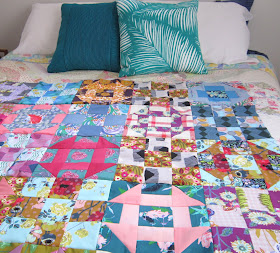
When I’m in a stash-busting mood I tend to look for a simple design, using a large variety of scraps.The 'wintersweet' pattern by Jo from Frankie and Ray had my name written all over it! It's made up in a scrappy mix of floral fabrics and combines two of my favouirte blocks, 9 patch and churn dash. Having the two different blocks mixes things up a bit, keeps your eye moving around the quilt, and keeps things interesting. Yes!

I had recently added a few new designer treats to my stash, some of AMH's conservatory fabrics - all of which seemed to work together seamlessly, without being overly matched.
I decided to use these new fabrics and started out pairing up fabrics that contrasted so that my blocks would still show up when they were all joined together. And I also made a few more blending combos to help with making it look not too chaotic or too busy. Well, these were my thoughts as I sewed.
It all started to unravel when I had to decide on the first border squares, see pattern pic below. I tried placing solid 5" squares around for the border, but it all looked flat. Next up, a selection of squares using the prints from the main part, too much colour, too confusing.
Usually I love gingham and florals together, so I tried adding a border of b&w gingham. But, what looked good in a small sample, did not look at all good over the whole quilt ... it suddenly began looking like a tablecloth ... out with the quick-un-pick, double fast!
Nope, it wasn't easy at all. Firstly, I had started out with quite a different fabric selection to the pattern cover. Next, I hadn't worked out a colour palette, not even a simple one to lock in a mood or theme. And then there were all those uncertainties I had regarding that first border.
I've spent some considerable time this week simmering over a solution. I chatted with my daughter about the issues I was having, and I looked online to see how others were combining these fabrics too, see here, here, here and here too.
As you can see, I ended up making a couple of changes to the original pattern. Today I made up five more blocks to give me a total of 30 blocks, set 5 x 6. Unintentionally going for all the colours in this one, it's still a bit wild and a bit busy, but I do love all the fabrics ... {wink wink} maybe just not all together!
Next up, border options, but that can wait until another day now.
Wishing you a scrap-happy weekend, hope your projects all go smoothly,
Linda
Linda


To be honest Linda, I’ve only just seen the 5” squares in the pattern pic!!!!! They get lost on the original too! I love the blue and white stripe you chosen in the last photo. And the one of it hanging on the stairwell is just gorgeous. I’m thinking you are too close to it at the moment to be objective. Leave it for a little while and I’m sure, with fresh eyes, you’ll come up with a fantastic solution. I still love it!
ReplyDeleteLots of fun combinations. You have had fun.
ReplyDeleteI agree with Susan. Step back for a while and look again with fresh eyes.
The light blue and white stripe is perfect! I think the outer border in the last picture look beautiful...Looking forward to seeing your final choice :)
ReplyDeleteThe light blue stripe fabric is perfect! Stepping back for a while sounds like a great advice!
ReplyDeleteLove it!!! The last picture is amazing. The blue and white stripe with that border fabric is perfect!
ReplyDeleteThe solids seem like they are helping pull the chaos together very well. Whatever it is that you've done, the last pic looks amazing with that printed border fabric next to it! Great new look to your blog too.:)
ReplyDeleteThanks so much Audrey. Hm-m-m sadly, I’m just a little reluctant to use that yummy border fabric on something I don’t quite l.o.v.e! The jury’s out still on this one!
DeleteAnd no time for sewing now, school hols here in NZ, with our little ones popping in & out over the next couple of weeks!
Hope you’ve had a pleasant weekend. Linda
I think we have all fallen for the more is more style of quilt, and realised that just a few less would have been better. Well done on keeping going, and I'm loving seeing how your process is evolving.
ReplyDeleteYour churn dashes come and go excellently. Good idea to use both solid and ombre/hand-dye? there. The pale blue and white stripe border makes a good breather and adds some contrast. Looks like you're enjoying the challenge you set.
ReplyDeleteI like the solid fabrics in the churn dash blocks - I think they help to hold everything together and stop it being overwhelming. I like that stripy border too. Good luck finding a final solution that pleases you.
ReplyDeleteLove your abundance of fabrics Linda and your stripe along with the AMH border fabric is perfection to me, I'm possibly biased because I have 3 metres of the fabric tucked away in my stash and adore it.
ReplyDelete