Hello hello. I've been so tempted to give improv another try again after seeing a few projects out there in the blogging world - in particular from
Kaja from 'sewslowly' and
Audrey from 'quiltyfolk'. It's something I really struggle with, but I still keep coming back for another go.
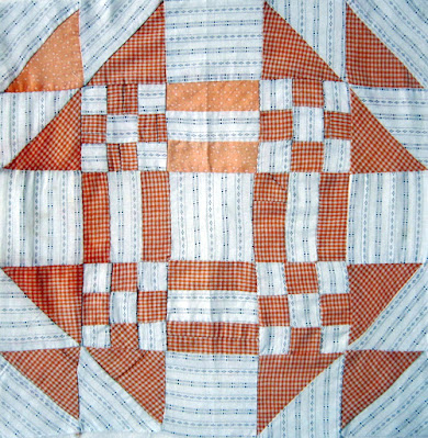
I started out with a hand pieced quilt block given to me by my daughter a few years ago which I've been keen to incorporate into a quilt top somewhere. If you look closely, you can see it's perfectly imperfect. The maker didn't fuss with the orientation of her stripe, she just let those triangles in the HST lay as they lay.
And while the background fabric is the same throughout the block, she must have run out of the orangery gingham as there's a small amount of spotty fabric substitute AND several pieces of the gingham have been joined carefully to make up some of the units.
Don't you just love the energy of a plaid, or a stripe, those directional prints which add to the charm and can make all the difference!
"Especially when they go a bit “off”. It’s not a look that everybody loves and I get that, but I love directional prints and how they can “make” something good into something extraordinary" Roberta Horton.
Anyway, after some faffing around, I settled on making my version of the make-do quilt pictured below, from Roderick Kiracofe's book 'Unconventional & Unexpected'. It's got a very scrappy, very utilitarian sort of look that has always appealed to me!
- from Roderick Kiracofe's book, "Unconventional & Unexpected" pg. 67 {see
here}
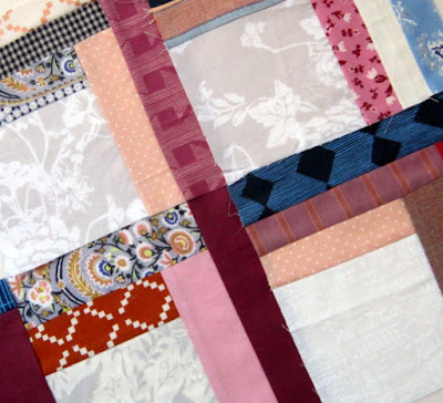
I wasn't too sure just where to begin with this actually! I ran off a photocopy of the quilt pic and sectioned it off into long strips and studied it for a bit. And then, eager to start, I pulled out a little fabric pile I had put aside some time ago and just jumped right in, beginning with the bottom right hand corner section with my vintage block.
But it's not as easy as one might think... the maths, getting the colours to flow from one row to the other, achieving that all important contrast in value.
And, if you stop by here often you may also notice I'm using a few more solids and tone-on-tone fabrics than I usually do. Another thing I find tricky!
Hm-m-m- so not feeling the love at. all.
After the weekend of struggling with this, I had a conversation with Audrey, many thanks for your advice 👍.
It's now looking more like how I imagined, after swopping out a few fabrics. I didn't want to completely replicate the original 1975 version, mine seems a bit more colour coordinated but it still has a few rogue surprise additions too!
Each time I come into the sewing room though, I move a bit, add a bit, discard a bit - it's a little like doing a jigsaw puzzle!
- checking the values out
At the moment I'm still deliberating between the light beige print
{see pic below} or maybe a dark brown print for that long strip down the centre
When you pop back next time {wink wink} you may find I've changed things around yet again,
but here's where I'm at today . . .
. . . and there's still lots more coin & rectangle segments to come


