Take these 16 patch blocks I'm making at present … I was going for a rather vague idea of combining
lots of Kaffe pastel spots. The more I sewed, the more I began exploring scale and value, and the clearer the picture became - one of a delightful mosaic effect in bright pastel blues & purples, with a little help from supporting floral fabrics in grey & pink, and a very useful white & black spot.
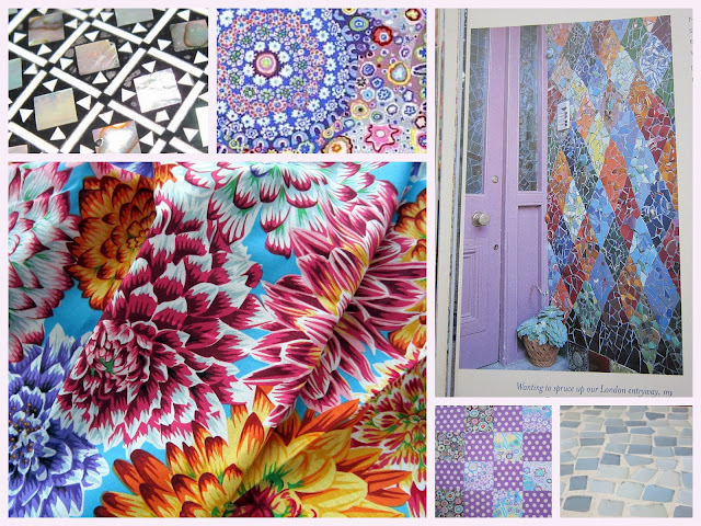
Then up popped Kaffes 'dancing dahlias' in multi! No need to rethink this though, the warm slivers of extra bright colour in this print are a super addition to the fractured look. Love the pic in one of Kaffe's books of a his entranceway, diamonds using smashed up garage sale and flea market finds, {see my inspiration collage pic below}.
Where there's lots started... and even a few finishes!
Tuesday, 6 July 2021
a spot of Kaffe colour
I spent a bit of time auditioning the blocks I'd made, adding repeats of colour and taking any glaringly 'wrong' blocks out. I ran out of time to actually get the top all sewn up, but here's how things were looking down on the design floor last night . . .
And a day later . . .
Quilt top stats:
The pattern is a St Louis 16 patch {with creative license!} using Kaffe fabrics
Initial inspiration was a quilt in Kaffe's latest book, but then I wandered slightly "off-piste" a little.
16 patch squares are 31/2” cut, 3” finished, so the blocks are 12” finished,
setting 5 blocks by 5
Linda
Subscribe to:
Post Comments (Atom)


17 comments:
You have such a good eye for clever, and sometimes unexpected, fabric combos.
Very pretty. You can’t go wrong with Kaffe fabrics.
Love these blocks, especially the way the stronger yellow bits work to move the eye around.
Stunning, as usual. I'm excited to begin my first 16 patch later today, but first I'm getting my 2nd covid shot this morning 🥳
Love your interpretation in fabric of his mosaic wall -- and I love watching your process.
Beautifully subtle. The bits of bright add a nice sparkle. I've been exploring a more subtle color palette myself this year with a couple of new makes.
I love those polka dots with Kaffe fabrics combo you are using...really neat...nice work--I often will make a few "trial" blocks and when i do i almost always segue way into something else...hugs have fun Julierose
Such a fun quilt. Sometimes Kaffe fabrics shout at you from within the quilt. This quilt doesn't do that. It just soulfully blends together, each fabric unique and special.
I like the yellow in the dahlia print, like Kaja, then my eye is drawn to all the blues, so many possibilities!
Beautiful blocks Linda, always good to read in a post the process as well as seeing the finishes. I love your colours here and the use of the KF spots, a favourite of mine and a great go to fabric. I look forward to seeing the full finished top!
A great mix of prints. I'm glad you added some different values and print designs to your quilt. Lovely.
Ooh I love Kaffe. Your simple blocks have so much joy and personality. They will make a gorgeous quilt.
I love this spot and colour combination
NICE!!! spots and dots and color in pattern... so refreshing
Gosh, that's a pretty flimsy, Linda! You did such a great job combining the prints for a nice blend, yet situating them in combinations that flatter each print.
These are looking wonderful together. Great when an idea clicks!
Love it!!
Post a Comment