After all the tricky piecing last week
I just had to take a break and sew a few scraps together.
I've been really *inspired by some wonderful quilters lately and I started thinking
maybe I could be a bit more adventurous!

- so I decided to attempt something just a bit different for me
I just had to take a break and sew a few scraps together.
I've been really *inspired by some wonderful quilters lately and I started thinking
maybe I could be a bit more adventurous!

- so I decided to attempt something just a bit different for me
I'm using a simple pattern called 'mosaic' from sharonhollanddesigns here
but not being a fan of sampler quilts just now, I'm repeating the same block.
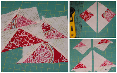
The flying geese units are made using the 'no waste' method . . .
I started out cautiously, making up a few blocks that clearly showed the pattern . . .

And then I began to find heaps of ways to create variety

And then I began to find heaps of ways to create variety
Certainly not everyone's cupoftea and {sigh} I did think twice about posting this quilt!
It's all kinda clashy & mixed up,
but I was loving how these random fabrics all played together
within this structured layout
within this structured layout
Funny how things change along the way though, isn't it?
I had originally envisaged simply setting all these blocks edge to edge
- just one big mix of saturated colour
{another idea for another time now}
- just one big mix of saturated colour
{another idea for another time now}
The more I looked at it,
the more the different framing strips seemed to block the flightpath flow somehow
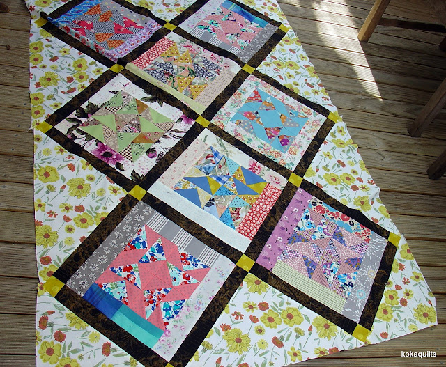
So here's what I ended up doing . . .
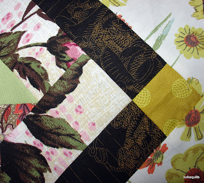
- close up of the thin sashing {an old Kaffe} & setting squares
- so nice to see the sun today!
Linking up with Myra for 'finished or not Friday' here at busyhandsquilts
a bit more #64
a little *insta inspiration
from Kathy with her 'get the mix' combos here - her feed is bursting with inspiration
Rachaeldaisy here, such amazing colour play
and Alison with her stunning "disarray of fabrics" in her pickledish blocks here
I've been totally inspired by Margaret's fun blocks here
- have a look at her use of scrappy colour! {and thanx for the +ve encouragement}
oh, and one last one - check out these fun wonky 'churn dash' blocks over here


13 comments:
I love how your sashing makes each block stand out more - sometimes sashing is best isn't it
I love it with the black sashing, and that gold accent. Your lighter toned background sets it off perfectly.
Great post sharing your proccess. I like the sashed version, but I also like the mish-mash one a lot.
I enjoyed your story. Your blocks are cheerful and beautiful with the sun shining in back.
Looking forward to seeing more.
I love the finale photo.....a stained glass window! The dark narrow sashing and yellow corner stone really pulls everything together beautifully. The sun is shinning here too and people are smiling.
I like 'kind of clashy and mixed up' but like the sashing too. Great links, including a couple of people I didn't know already - thanks!
I love the way this quilt top is made! It shows a great way to use up busy prints. I love the dark sashing too. It makes you look at the blocks more closely allowing you to see the prints used. I love it!!
ooh yes! looove... and the stained glass effect too... gorgeous!
Love the scrappiness of the blocks. They are scrappy but go together so well.
Glad you enjoyed the links!
It wasn’t really where I was heading with these blocks, but I’m happy with the finished effect.
And yes, I too love the mish-mash version. Very keen to give this idea another go now, sans sashing!
Love the blocks Linda and I think your idea of using the dark sashing really sets them off. Thanks for the links, I have to be more organised with Instagram and these have inspired me to get busy!
Th dark sashing works so well, shows up each individual block beautifully. Good idea.
Lots of beautiful pattern and color. The black sashing really works with those blocks. Inspired addition.
Post a Comment